THE POSTER.

RESEARCH: FILM POSTERS: "FILL ME IN".
The film poster for this film is used to inform the audience of the genre of the movie. The main focus of the poster is on the characters that are positioned centrally within the poster. They are the main feature of the poster and the figures are dressed in bold colours juxtaposing the white background. The use of white in the poster draws the viewers’ attention to the figures reinforcing how they are the main focus point within the poster. The genre of drama is conveyed by the expression and body language of the main figures within the poster. The female on the right is presented to the viewer as irritated towards the male within the poster this is proved by her crossed arms and the look of disdain expressed on her face. The female on the left is shown to be leaning on the male looking in the opposite direction of the other woman. The male is the dominant figure within the film and is presented as if he is torn between the two women, the fact that one of the females in seen to be leaning on his back may suggest that romance occurred without the other female knowing, reinforced by the caption at the top of the poster “ Would you give him a second chance?”, this is presented in red capital letters with the word you “you” coloured in black, makes it stand out to the viewer and giving a more personal view to the poster. The red text of the title looks as if it has been shaded in; the colour of the text is related to the danger as well as love therefore proving that it has a double meaning, portraying the emotions of the film to the viewer. The film was easy to find, this was proved when it came up as the first link to the film when searched on the internet, thus proving that it was a well distributed film.


RESEARCH: FILM POSTERS: "COLD".
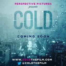
In today's lesson we researched P&A for short films and how they represent the genre of the film.
We found that "Cold" was not very well advertised as it was a small budget film and was not widely distributed, therefore taking a long time for us to find the film poster.
The film was developed by Ryerson University Media and is an independent short film by Perspective Pictures.
It was released online by Vimeo, this is how the film describes itself: "In a city notorious for being cold to strangers, several lives intersect one night, oblivious to the loneliness that connects them all", the deep blue colours make the poster seem cold on its own which reinforces the film title. The film title "Cold" is in capital letters and a bold font making it eve catching for viewers. The colours used for the title match the colours of the back ground poster which are predominantly blue. Below the title we see the words "coming soon" which are written in a darker shade of blue, this colour is naturally a cold colour and is normally associated with cold weather such as rain and snow which proves the genre of the film. The posters make it look as if the viewer is looking out of a frosted window and the opacity of the word cold make it look as if it has been written in the glass. Therefore the poster overall suggest the genre of the film however due to the fact it is an independent film it was not widely known.
The watermarks and over exposure used draw in the viewer and make them feel physically cold when looking at the film poster. We researched the film further and found that producers have made a twitter page.
RESEARCH: FILM POSTERS: "HIGH MAINTENANCE".

Today in lesson we looked at film posters, specifically at the film "High Maintenance" we had to analyse them and say how publishing and advertising were used effectively.
The film has a poster and trailer which helps to distribute the film widely and make the film more widely known. The main colour that dominates the film poster is black which is effective in portraying drama within the poster as it sets the tone, not only this but the dark colour informs the viewer of the genre of the film.
The close-up image of the face is the main focus of the poster, in this image we see a beautiful young woman deep in thought which may be suggestive of the events which may occur.
The bold font stands out from the black background as it is a contrasting colour which makes it easily identifiable by the size and the viewers eyes are immediately drawn to the title of the film, this suggests to the audience that the genre of the film is drama and romance.
CONSTRUCTION: POSTER AND WEBSITE.
Today I made the film poster. This publishing and advertising helps promote our film and enables people to watch trailer as well as access information about the film and directors, it also has a link to our twitter and facebook page. Before making the website and the poster we researched others to see how they were set out and how the information was displayed. From this we then planned our own poster and went on to make it, I developed this further by making the website that would be used to promote the film, bringing in viewers.
Research into short film posters includes three pieces of analysis. Confident understanding of genre conventions: institutional information (bold title, required credits in appropriate font, date); inclusion of social media links (logos for Twitter, FB, Instagram); features characters and location from the film. Good design that would attract and addres the target audience of younger females:
ReplyDeletestriking the sign for title composed of Post It notes that feature in the film; concealed identity of mystery man, bright colours signalling romantic comedy genre. The poster makes a convincing package combined with the radio trailer to promote the film.