In today's lesson
we researched P&A for short films and how they represent the genre of the film.
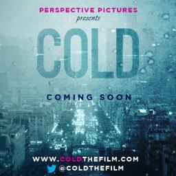
We found that "Cold" was not very well advertised as it was a small budget film and was not widely distributed, therefore taking a long time for us to find the film poster.
The film was developed by Ryerson University Media and is an independent short film by Perspective Pictures.
It was released online by Vimeo, this is how the film describes itself: "In a city notorious for being cold to strangers, several lives intersect one night, oblivious to the loneliness that connects them all", the deep blue colours make the poster seem cold on its own which reinforces the film title. The film title "Cold" is in capital letters and a bold font making it eve catching for viewers. The colours used for the title match the colours of the back ground poster which are predominantly blue. Below the title we see the words "coming soon" which are written in a darker shade of blue, this colour is naturally a cold colour and is normally associated with cold weather such as rain and snow which proves the genre of the film. The posters make it look as if the viewer is looking out of a frosted window and the opacity of the word cold make it look as if it has been written in the glass. Therefore the poster overall suggest the genre of the film however due to the fact it is an independent film it was not widely known.
The watermarks and over exposure used draw in the viewer and make them feel physically cold when looking at the film poster. We researched the film further and found that producers have made a twitter page.
Go back to your class work on Monday 6 October and complete this post as there is a great deal more institutional information that you unearthed which you have not posted here.
ReplyDelete